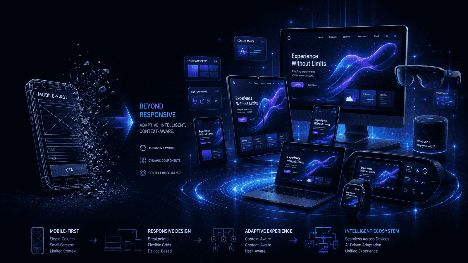
Mobile-first design had its moment in the spotlight for a long time. Everyone treated it like the golden rule of building websites. However, things are starting to shift a little. So, people are now asking a pretty interesting question. Is mobile-first still the king, or is it slowly stepping aside?
Let us break it down with Perth web development as the focus.
Why Mobile-First Was Such a Big Thing
A few years ago, websites were mostly built for desktops. Designers focused on big screens first. Mobile versions came later as a quick fix. That approach caused a lot of problems.
Websites looked clunky on phones. Text felt tiny and hard to read. Navigation felt like a puzzle. So, designers flipped the whole idea.
They started designing for mobile screens first. This approach forced them to keep things simple. Moreover, it made websites faster and easier to use. People loved it because it actually worked.
Even teams working in Perth web development jumped on this trend. It helped them build cleaner and more user-friendly websites.
But Things Are Changing Now
Here is the thing. People do not just use one device anymore. They jump from phones to laptops to tablets all the time. So, focusing only on mobile feels a bit limited now.
For example, someone might browse a website on their phone during a break. Later, they might switch to a laptop to finish what they started. That journey needs to feel smooth.
Moreover, new devices are popping up everywhere. Foldable phones are becoming popular. Smart TVs and wearables are also part of daily life now. So, one-size-fits-all thinking does not really cut it anymore.
In fields like Perth web development, designers are starting to think beyond just mobile screens.
Say Hello to Multi-Device Thinking
Now the focus is shifting to something bigger. It is called multi-device design. Sounds fancy, but it is actually pretty simple.
Instead of thinking about one screen, designers think about the whole journey. They look at how people move between devices. They make sure everything feels connected.
For example, you might add items to a cart on your phone. Later, you complete the purchase on your laptop. Everything should feel consistent and easy.
So, it is less about mobile-first and more about experience-first.
Content Comes First Now
Another cool shift is happening in how designers think. Content-first design is becoming popular.
Instead of starting with layouts, designers start with the message. They ask what users actually need. Moreover, they organise content in a way that works everywhere.
This approach keeps things clear and focused. Users get straight to the point without distractions. So, the design supports the content instead of overpowering it.
Teams in Perth web development often use this method to create more meaningful websites.
Adaptive Design Is Back in the Game
You might have heard about responsive design. It adjusts layouts based on screen size. Adaptive design works a bit differently.
It creates specific layouts for different devices. Each version is designed with purpose. So, users get a more tailored experience.
For example, a desktop version might include more features. A mobile version might stay simple and clean. Both versions feel right for their screens.
Moreover, designers get more control over how things look and behave.
Websites Are Getting Smarter
Now here is where things get really interesting. Websites are starting to understand users better. This idea is called context-aware design.
It looks at things like location, time, and behaviour. Then it adjusts the experience.
For example, a food app might show lunch deals during the day. It might show dinner options in the evening. That feels smart and helpful.
Moreover, it makes users feel like the website gets them. That kind of connection is powerful.
This trend is growing fast in Perth web development as businesses try to stand out.
Not Just Screens Anymore
People are not just tapping screens these days. They are talking to devices. They are using gestures. Technology is changing how we interact.
Voice assistants are everywhere now. Users can search and navigate using their voice. So, design needs to adapt to this shift.
Designers now think about sound and movement, not just visuals. Moreover, this opens up a whole new world of creativity.
Speed Is Everything
Let us be real. Nobody likes a slow website. If a page takes too long to load, people leave. It is that simple.
So, performance is becoming super important. Designers and developers work hard to keep things fast. They optimise images and clean up code.
Moreover, faster websites rank better and keep users happy. Businesses in Perth web development focus a lot on speed to stay competitive.
Personalisation Is the New Normal
People love experiences that feel personal. They do not want generic websites anymore. They want something that feels made for them.
Websites now use data to customise content. They show products based on user interests. Moreover, they adjust layouts to match preferences.
This makes users more engaged. It also builds stronger connections with brands.
Teams working in Perth web development often use personalisation to improve results.
Final Thoughts
Web design never stays the same for long. Mobile-first design had a huge impact. It made websites better and easier to use. However, things are evolving now. The focus is shifting to bigger and smarter ideas. It is about creating seamless experiences across all devices.
To know more, feel free to contact Make My Website, one of the finest agencies for web design.